Retail Nightmare: A Trip Inside Peter Strickland’s Sensorium

Fear and desire lie at the heart of Peter Strickland’s cinema, whether he’s exploring those themes through the sonic, the sexual, the sartorial, or some diabolical combination of all three. With his masterful sense of film technique, the British director has developed a lavish style that merges the influence of such avant-garde titans as Stan Brakhage with the perverse pleasures of sensualist European art-house cinema of the seventies.
After growing up in Reading, England, and traveling to New York City in his twenties, Strickland first garnered international acclaim with Berberian Sound Studio (2012),an Italian-horror-inspired study of madness, and The Duke of Burgundy (2014), a kinky melodrama about the sexual power play between two women. His latest fantasia, In Fabric, is set in an unnerving facsimile of 1993 England and follows the story of a recently separated bank teller (Marianne Jean-Baptiste) who looks for love in lonely-hearts newspaper ads. While treating herself at a frenzied January department-store sale, she buys a confidence-boosting dress, only to discover the garment is cursed to possess and destroy anyone who wears it.
Ahead of In Fabric’s opening at the Metrograph in New York, I talked with Strickland about how his strange visions have been influenced by his early experiences of bold repertory-film programming, his sensitivity to sound, and his childhood memories of shopping with his mother.
I love being immersed in the world of your films and the way they feel both uniquely yours and in dialogue with cinema of the past. Was there a specific film experience that helped inspire your sensibility?
For me it was seeing Eraserhead when I was sixteen. I’d not seen anything like it before, and it was absolutely life-changing. I was living in Reading—suburban middle-class UK—so Eraserhead was a taste of something exotic, underground, and illicit. The screening was connected to the Scala cinema in London and Jane Giles’s programming, which was a huge influence on me. At the Scala you’d get these anarchic programs and double bills where they’d show Eyes Without a Face with Santa Sangre, or Russ Meyer and Dario Argento with Fassbinder and Tarkovsky. Argento is high art now, but in the early nineties people would dismiss that kind of cinema. Jane Giles was one of the first people to say, look, this can go on the same canvas as a Fassbinder film. There was no hierarchy.
Do you think that fusion of high and low art seeped into your filmmaking DNA?
I suppose it has, although it wasn’t anything conscious. Actually, with Eraserhead, I was purposely trying not to be influenced by it. I spent years writing, in the early nineties, just trying to escape what they call this “anxiety of influence.” Everything I wrote was connected to Eraserhead, so I tried very hard to snap that umbilical cord. I was also influenced by a book called Light Moving in Time, by William C. Wees, which is about Stan Brakhage, Kenneth Anger, Maya Deren, Jordan Nelson, the Whitney brothers . . . but you couldn’t see those films anywhere, so I would just imagine what they were like and try to copy the techniques they used. Obviously, what I did never came close.
Tell me a bit about the kinds of filmmaking you were exposed to during your time in New York.
I first came to New York in 1994. I had a Greek aunt who lived in Woodhaven, and as a student I could get a ticket for £200, stay with my aunt, and get the J train to Manhattan. It was incredible. I’d go to Anthology Film Archives. I was seeing a lot of the Cinema of Transgression, like Where Evil Dwells, by Tommy Turner and David Wojnarowicz, which was very feral and almost like Gummo before Gummo. There were people like Tessa Hughes-Freeland doing these projected, abstract films with John Zorn, and J. G. Thirlwell doing live soundtracks, and M. M. Serra doing her work. Nick Zedd used to project films onto buildings across the street. If he couldn’t get a screen, he would just do it his own way. After growing up in isolation in Reading and not having that kind of community, it was just exciting to see that.
I also loved the sense of mischief that I got from Paul Morrissey’s films, which are really progressive. No one in his films ever says if they’re gay or straight; no one ever says if they’re male or female or if they’re trans. The use of nudity is also wonderful. Now you’d have to justify that, but it’s like, how can you justify Joe Dallesandro on-screen standing naked next to a welfare officer? It just works, and it’s wonderful.

In Fabric often feels like it’s floating between eras, but it is set specifically in the early nineties, this formative time in your artistic life. Why did you choose 1993?
The reason I set it then was because I wanted to have the mode of dating be these written personal adverts in the paper. I wanted Marianne to present herself in that little box. 1993 was perhaps the cut-off year before the internet became mainstream; after that, people switched to online dating. I used to love reading those adverts because you really have to put on your best show, so it was an ideal way of presenting her character.
Jackson’s, the store in Reading that influenced the film, didn’t close until 2013—but even then it felt like you were going back in time. It was this mixture of Edwardian and Victorian Britain with the fifties, sixties, or seventies—but never beyond that. I wanted to have the contrast of the streets being contemporary with this time bubble you enter into in the store.
Tell me about your relationship to department stores. Do you have early shopping memories?
I was dragged there while my mother would try stuff on. The places she went to were these middle-class stores, but they had a kind of aspirational quality. There was an element of fantasy to the dresses—you’d imagine yourself being invited to the Swiss embassy for canapés or something. They were trying to be elegant, but there was always something quite off about what they were selling.
The clothing in your film isn’t functional, it’s fantastical—but it’s not haute couture.
Absolutely, and that was always the direction I gave while working with Jo Thompson, our costume designer. I was also interested in how theatrical these department stores were. When I’ve been interviewed about In Fabric, I keep getting asked about giallo. I’ve obviously seen one or two giallo films, and my second film was loosely in that world, but it was not remotely on my mind. I’m not attracted to violence, but I am attracted to the flamboyance of those films, the heightened colors and production design. I didn’t know until recently that I’m prone to reacting to ASMR, so I used it consciously in this film because I remember the particular sound of those stores. They were very quiet—not like stores now, which are very loud—and there was the sound of the pages in these catalogues. That high-gloss paper—just the sound of the pages turning would trigger this intense relaxation for me. People mistake it as erotic, but it’s not; you just go into a bit of a zone-out.
I remember how thick the carpets were in those stores and how they muffled the sound of everything. I tried to use a child’s perspective, like when you’re a kid and you look at a dumbwaiter and you don’t know where it leads so you wonder if it goes all the way down to hell . . . or you wonder, do mannequins bleed? In the seventies, the hands on the mannequins were very splayed out, as if they were casting a spell on you. I also remember seeing garments that I didn’t know the purpose of. You’d see a suspender belt and think, what’s that? You knew it was something intimate, so there was a combination of the nightmarish and the erotic. When you’re a kid there’s no language for the erotic, but you sense the power of something beyond your comprehension. This film was an excuse to explore those visceral responses to clothing.
Watching the film, I found myself responding to the pleasure of feeling transformed by a garment.
Yeah, that’s what’s fascinating to me, and we only scratched the surface. But it was that feeling of escape, and as you say, of transformation. I’ve called the film a “retail nightmare,” but I don’t think there’s anything wrong with putting something on and feeling better about yourself. It’s an animal instinct.
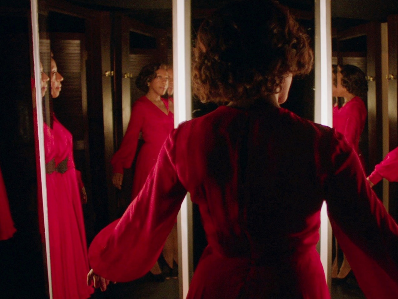
The dress is the villain in this movie. How did you go about conceiving that design?
The first thing was to work out how it would move, because one of the early images in my head was of the dress floating in the air. I wanted it to look like jellyfish or an amoeba. So Jo would say, okay, we need silk and chiffon. I wanted this garish red, the same kind of red you’d have on these mannequin fingernails or fake blood from seventies films. That was a pretty simple decision, but the cut of the dress was Jo’s work.
The film is so lush, and it’s not just the costumes, it’s also the production and lighting design and the catalogue montages. What kind of visual research did you do?
This was a tough one, because I underestimated how much text there would need to be for the newspapers and catalogues. I spent a lot of time writing that stuff because I wanted to have that detail in there. Edward Kienholz, a sculptor who made a lot of these very, very intense mannequin sculptures, was an inspiration for me. His work tapped into my nightmares when I was a kid. I used to call them “cross dolls” because they looked so angry and their eyebrows were so angular, unlike the mannequins now. We also looked at Aki Kaurismäki films because I love the kind of theatrical lighting he does, that strong lighting that’s almost going back to Technicolor, like Douglas Sirk. But I didn’t want to go into a Sirk direction, which is something that’s difficult to do on a small budget.
In the past you’ve also mentioned being inspired by album covers.
Yes! It was the cover of The Sylvie and Babs Hi-Fi Companion, which is this collage with a mannequin hand intruding over it. It was such a nightmare image, and I completely ripped that off. There’s also pop cinema like Who Are You, Polly Maggoo?, which used found catalogue images and gave them this big canvas. Although the catalogue images we had were not found.

You’ve had a series of close collaborations with musicians, and your scores set the atmosphere so instantly in your films. I’m curious if you already know what a film will sound like when you’re writing?
It varies from film to film. With Berberian, I was inexperienced working with musicians, so I’d play them music I liked and music that inspired the writing, but that was self-defeating in a way, because you’re limiting their scope. For The Duke of Burgundy—with Rachel Zeffira and Faris Badwan, of Cat Eyes—we spoke more about instruments and mood and tempo and Luis de Pablo’s score for The Spirit of the Beehive, but we tried not to be too slavish about it. With In Fabric, we went even further by having Tim Gane, of Cavern of Anti-Matter, write demos before we even had a script and then it slowly evolved from there. But I’m writing a film now where I’m going to use existing classical music and avant-garde music, and one day I’d love to have a film with no music.
What was the last thing you saw or heard that really struck you?
Charlotte Gainsbourg’s latest album is amazing. You can hear elements of Jane Birkin and Serge Gainsbourg in there, but it’s obviously her own thing. I also loved The Lighthouse; that was a great film.
All photos courtesy of A24.

More: Interviews

The Urgency of the Moment: A Conversation with Lizzie Borden
Fiercely committed to the possibilities of political art, the trailblazing director talks about how her intersectional understanding of feminism imbues her films, three of which are now playing on the Criterion Channel.

How Dweller Charts a Path Through Black Queer Spaces
Ryan Clarke and S*an D. Henry-Smith—two curators behind New York City’s premier Black electronic music festival—talk about the films they selected for Radical Dreams, Underground Sounds, a collection now playing on the Criterion Channel.

Wild Combinations: A Conversation with Matt Wolf
Combining a passion for preservation with a desire for experimentation, the documentary filmmaker creates portraits of visionary outsiders in a style guided less by narrative than by emotion.

Curator Jonathan Ali on the Cutting Edge of Caribbean Cinema
The programmer of Third Horizon, a series now playing on the Criterion Channel, discusses the challenges of cinematic representation and the need to think beyond its limits.